Dynamic Visualization
Course Schedule
Datacamp
Many people behind on DataCamp Courses.
Questions? Concerns?
Resource Presentations
Case Study Presentations - Let’s pick a winner!
Next Week’s Case Study
HTML Visualization
DataTables
DataTables display R data frames as interactive HTML tables (with filtering, pagination, sorting, and search). This is a great way to make your raw data viewable without using too much space.
Don’t use for large datasets in your website, though! (Any idea why?)
Leaflet
Leaflet is a really powerful JavaScript library for creating dynamic maps that support panning and zooming along with various annotations like markers, polygons, and popups.
library(leaflet)
library(ggmap)
m <- leaflet() %>% setView(lng = -78.88642, lat = 42.89606, zoom = 12) %>%   addTiles()
Most HTML outputs will need to be run with frameWidget()
to appear in a rmarkdown/quarto document. Simply wrap the output
with:
dygraphs
Provides rich facilities for charting time-series data in R, including highly configurable series- and axis-display and interactive features like zoom/pan and series/point highlighting.
rthreejs
Create interactive 3D scatter plots, network plots, and globes using the ‘three.js’ visualization library.
Steamgraph
#devtools::install_github("hrbrmstr/streamgraph")
library(streamgraph)

# Create data:
data <- data.frame(
  year=rep(seq(1990,2016) , each=10),
  name=rep(letters[1:10] , 27),
  value=sample( seq(0,1,0.0001) , 270)
)

# Stream graph with a legend
pp <- streamgraph(data, key="name", value="value", date="year", height="300px", width="1000px") %>%
  sg_legend(show=TRUE, label="names: ")
## Warning in widget_html(name, package, id = x$id, style = css(width =
## validateCssUnit(sizeInfo$width), : streamgraph_html returned an object of class
## `list` instead of a `shiny.tag`.## Warning: `bindFillRole()` only works on htmltools::tag() objects (e.g., div(),
## p(), etc.), not objects of type 'list'.networkD3
Creates ‘D3’ ‘JavaScript’ network, tree, dendrogram, and Sankey graphs from ‘R’.
Load example network
This loads an example social network of friendships between 34 members of a karate club at a US university in the 1970s. See W. W. Zachary, An information flow model for conflict and fission in small groups, Journal of Anthropological Research 33, 452-473 (1977).
karate <- make_graph("Zachary")
wc <- cluster_walktrap(karate)
members <- membership(wc)

# Convert to object suitable for networkD3
karate_d3 <- igraph_to_networkD3(karate, group = members)

n3d=forceNetwork(Links = karate_d3$links, Nodes = karate_d3$nodes,
             Source = 'source', Target = 'target', NodeID = 'name',
             Group = 'group')
Force directed network plot
Sankey Network graph
Sankey diagrams are flow diagrams in which the width of the arrows is shown proportionally to the flow quantity.
# Load energy projection data
library(jsonlite)
URL <- paste0(
        "https://cdn.rawgit.com/christophergandrud/networkD3/",
        "master/JSONdata/energy.json")
Energy <- fromJSON(URL)

sn1=sankeyNetwork(Links = Energy$links, Nodes = Energy$nodes, Source = "source",
             Target = "target", Value = "value", NodeID = "name",
             units = "TWh", fontSize = 12, nodeWidth = 30)
Radial Network
URL <- "https://raw.githubusercontent.com/christophergandrud/networkD3/master/JSONdata/flare.json"
## Convert to list format
Flare <- jsonlite::fromJSON(URL, simplifyDataFrame = FALSE)
# Use subset of data for more readable diagram
Flare$children = Flare$children[1:3]

rn1=radialNetwork(List = Flare, fontSize = 10, opacity = 0.9, height = 400, width=400)
Diagonal Network
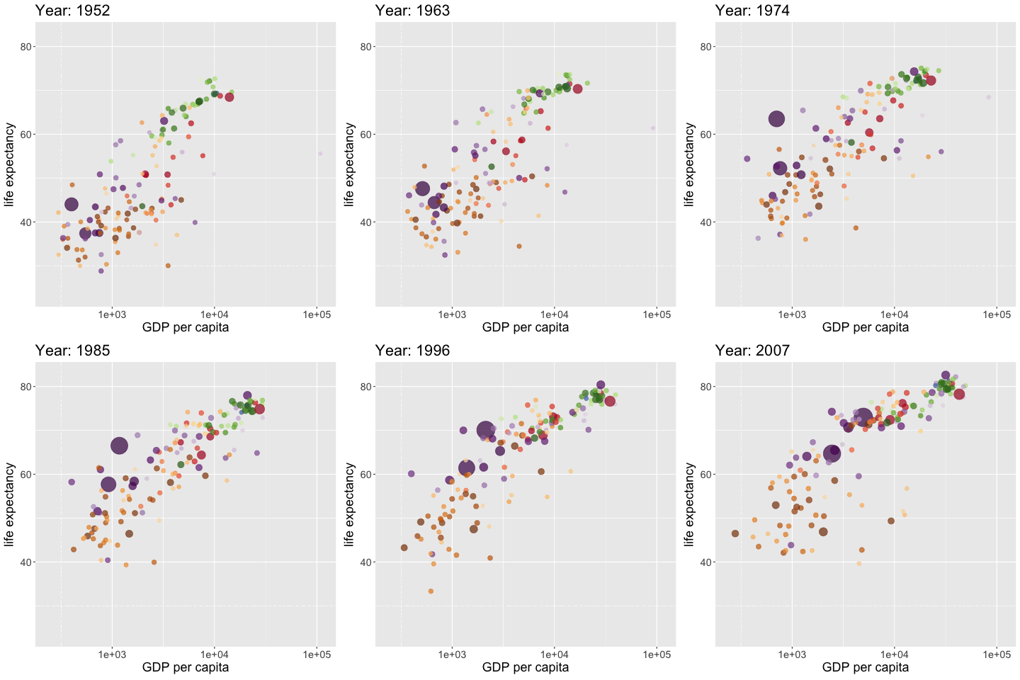
gganimate
library(ggplot2)
library(gganimate)
library(gapminder)

p <- ggplot(gapminder, aes(gdpPercap, lifeExp, size = pop, colour = country)) +
  geom_point(alpha = 0.7, show.legend = FALSE) +
  scale_colour_manual(values = country_colors) +
  scale_size(range = c(2, 12)) +
  scale_x_log10() +
  labs(title = "Year: {frame_time}", x = "GDP per capita", y = "life expectancy")

anim <- p + transition_time(year) +
  ease_aes("linear")

anim_save("pres/gganimate-1.gif", anim)
