Getting Help!
Learning more about finding help
Reading
- How to write a reproducible example
- Using Reprex package
Tasks
- Learn how to read R help files effectively
- Learn how to search for help
- Learn how to create a Minimum Working Example (MWE)
- Debug existing code
- Post your reprex as an ‘issue’ in github
- Post your repex to slack
Libraries
library(tidyverse)
library(reprex)
library(sf)

library(spData)
data(world)
Your problem
You want to make a figure illustrating the distribution of GDP per
capita for all countries within each continent using the
world data in the spData package.
Your goal
Your desired figure looks something like the following:

Current Version of your code
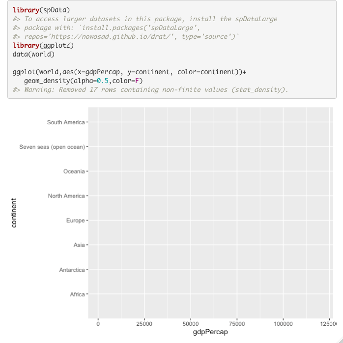
You have started working on the figure but can’t seem to make it work like you want. Here is your current version of the code (and the resulting figure):
ggplot(world,aes(x=gdpPercap, y=continent, color=continent))+
   geom_density(alpha=0.5,color=F)
The second figure is quite different from the one you want. You want
to ask for help and so you know that you need to make a reproducible
example. Starting with the code above, make the required edits so you
can use reprex() to generate a nicely formatted example
that you could post as a github ‘issue,’ send as an email or post to a
forum to ask for help. See the reading for more help. Note:
you do not need to recreate the first figure above, only to use
reprex() to illustrate your question and problematic
code.
Steps
- Download the starter R script (if desired). Save this directly to your course folder (repository) so you don’t lose track of it!
- Add code (only 3 lines) needed to produce the second plot (hint: make sure the data are available)
- Copy the code to your clipboard
- Post as an ‘issue’ in github
- run
reprex(venue="gh")to generate the reproducible example and put the content on your clipboard - go to your repository on github
- click on the “issues” tab (to the right of the ‘code’ tab)
- click the green ‘New issue’ button
- paste the reprex in the “leave a comment” box
- Add an informative title (“Example repex”?)
- run
- Post to the slack #reprex channel
- run
reprex(venue="gh")to generate the reproducible example - paste in the reprex channel.
- run
It should look something like this:

Fix the code above to recreate the first figure.